We are introducing Dashboards in ERP Core. Dashboards show you quick insights of the business dynamics in the form of charts and tables. You can monitor and measure business performance and metrics and hence makes smarter decisions.
Types of Dashboards are as follows :
- Sales Dashboard
- Purchase Dashboard
- Cash Flow Dashboard
- Receivable Dashboard
- Payable Dashboard
- User Stats
- Report Stats
- Inventory Dashboard
- Production and Consumption Dashboard
- Profit Dashboard
In this blog, we’ll walk you through these dashboards to visualise your data in the form of charts and tables.
Sales Dashboard
There are 6 charts in this dashboard.
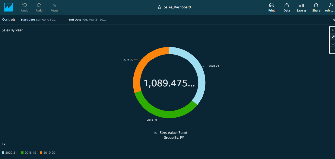
Sales By Year
- This chart shows the current year sales vis-a-vis last 2 years’ Sales performance.
- You can drill down from Year->Quarter and from Quarter->Month and back.
- You can filter the Charts with a given date range. For example, you can view the performance for just a week.
Note: A Filter, as a rule, works across all charts in a Dashboard.
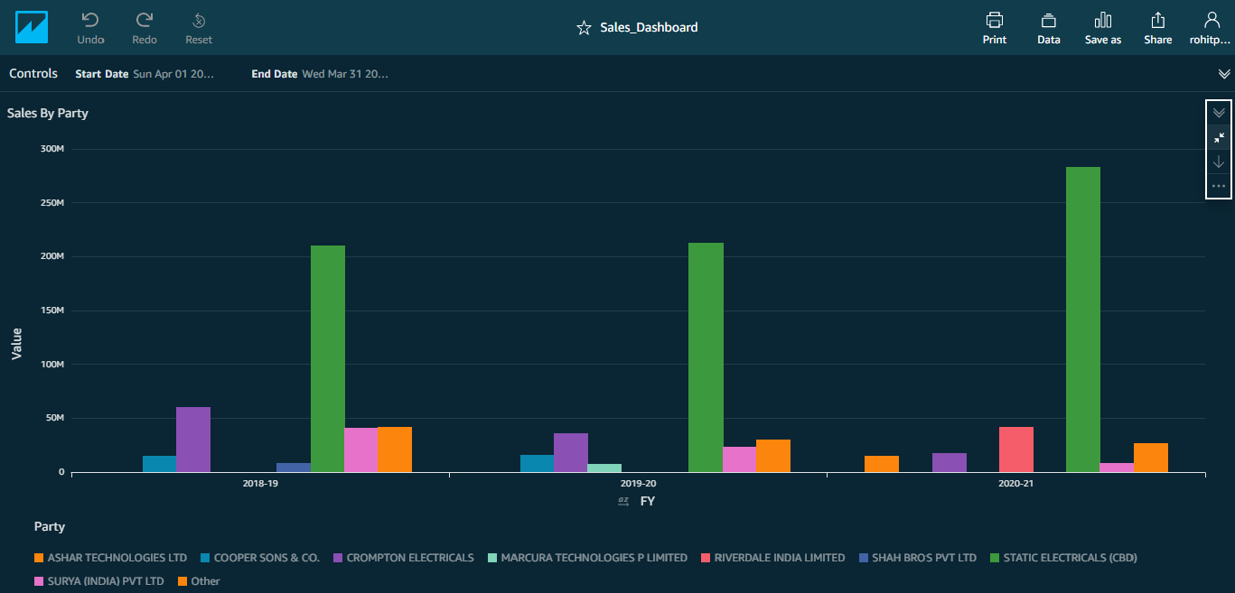
Sales By Party
- This chart shows the current year sales vis-a-vis last 2 years’ Sales performance by Party.
- You can filter the Charts with a given date range. For example, you can view the performance for just a week.
- You can drill down from Year->Quarter and from Quarter->Month and back.
- To see the sales of a particular party, just place the cursor on the bar.
- Legend at the bottom displays the top n Parties.
Note: All data represented are imaginary and are used for illustration purposes only.
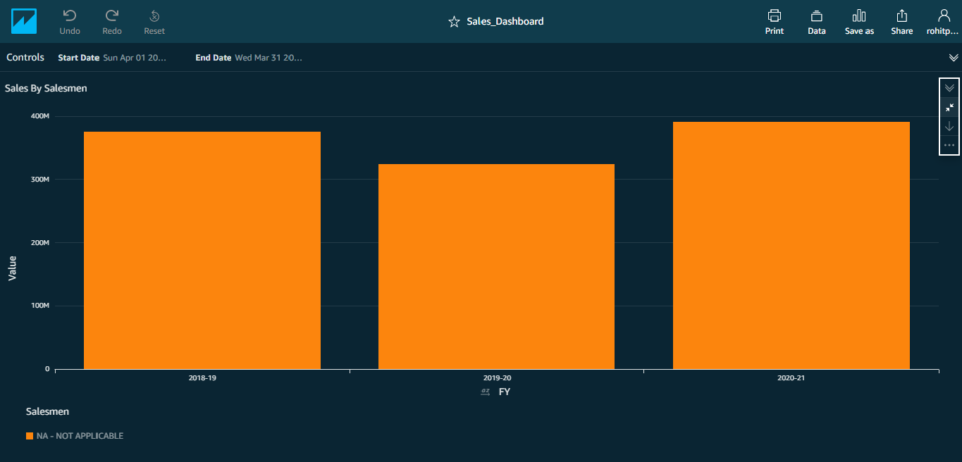
Sales By Salesmen
- This chart shows the current year sales vis-a-vis last 2 years’ Sales performance by Salesmen.
Note: Incase there are no salesmen, you will just see 3 plain bars.
- You can filter the Charts with a given date range. For example, you can view the performance for just a week.
- You can drill down from Year->Quarter and from Quarter->Month and back.
- To see the sales of a particular salesman, just place the cursor on the bar.
- Legend at the bottom displays the top n Salesmen.
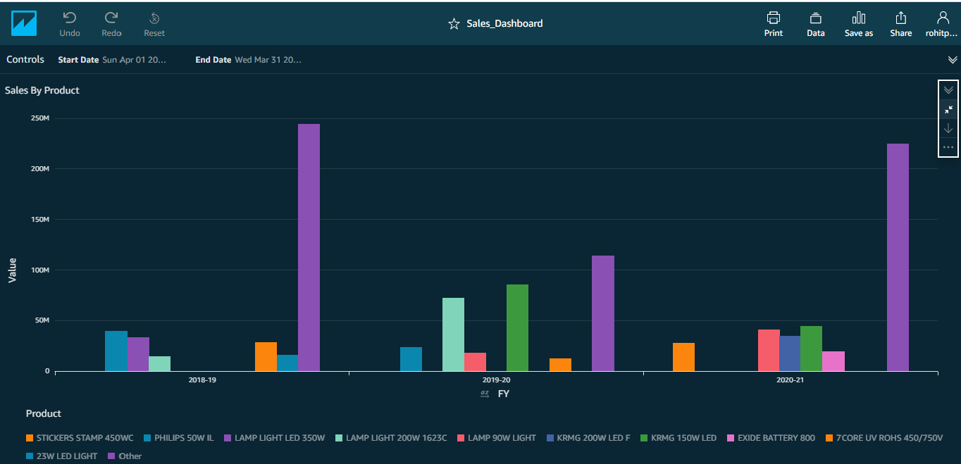
Sales By Product
- This chart shows the current year sales vis-a-vis last 2 years’ Sales performance by Product.
- You can filter the Charts with a given date range. For example, you can view the performance for just a week.
- You can drill down from Year->Quarter and from Quarter->Month and back.
- To see the sales of a particular product, just place the cursor on the bar.
- Legend at the bottom displays the top n Products.
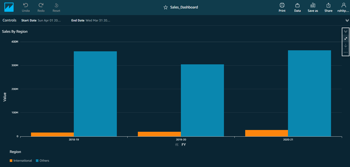
Sales By Region
- This chart shows the current year sales vis-a-vis last 2 years’ Sales performance by Region.
- You can filter the Charts with a given date range. For example, you can view the performance for just a week.
- You can drill down from Year->Quarter and from Quarter->Month and back.
- To see the sales of a particular region, just place the cursor on the bar.
- Legend at the bottom displays the top n Regions.
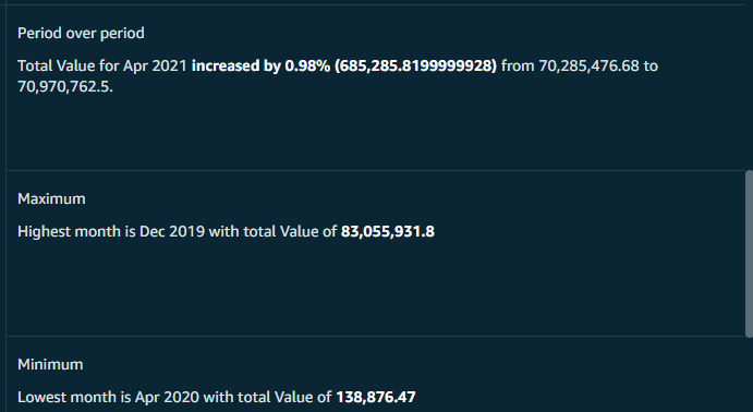
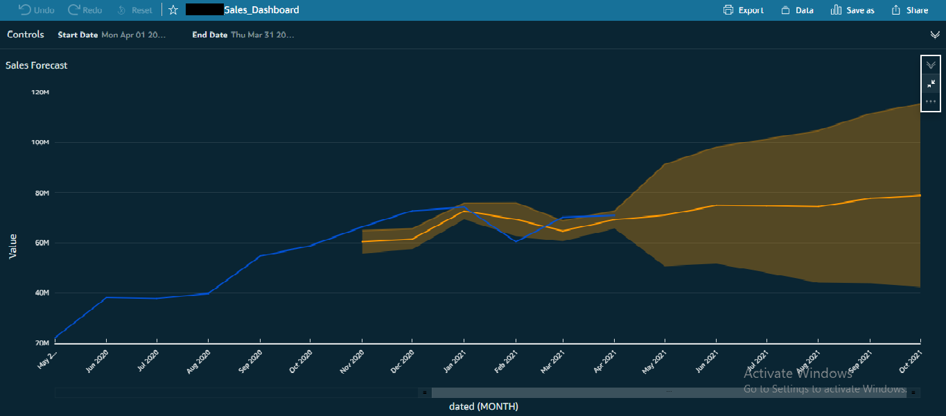
Insights & Forecast
- By default you can see the month-over-month performance for the latest month besides the highest & lowest performance months.
- System also shows the forecast for next 6 months.
- You can also see the upper / lower bounds & the expected value.
- System also plots the backcast for previous 6 months to get a fair idea of how machine language based extrapolation works.
Purchase Dashboard
There are 4 charts in this dashboard.
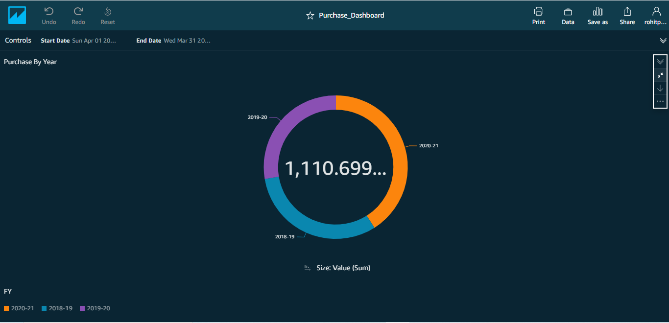
Purchase By Year
- This chart shows the current year purchase vis-a-vis last 2 years’ Purchase performance.
- You can filter the Charts with a given date range. For example, you can view the performance for just a week.
Note: Filter works across all charts.
- You can drill down from Year->Quarter and from Quarter->Month and back.
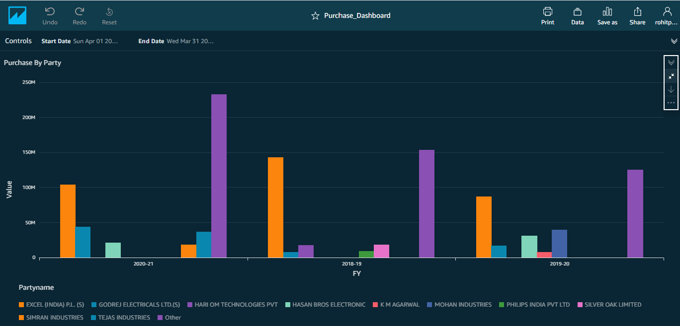
Purchase By Party
- This chart shows the current year purchase vis-a-vis last 2 years’ Purchase performance by Party.
- You can filter the Charts with a given date range. For example, you can view the performance for just a week.
- You can drill down from Year->Quarter and from Quarter->Month and back.
- To see the purchases of a particular party, just place the cursor on the bar.
- Legend at the bottom displays the top n Parties.
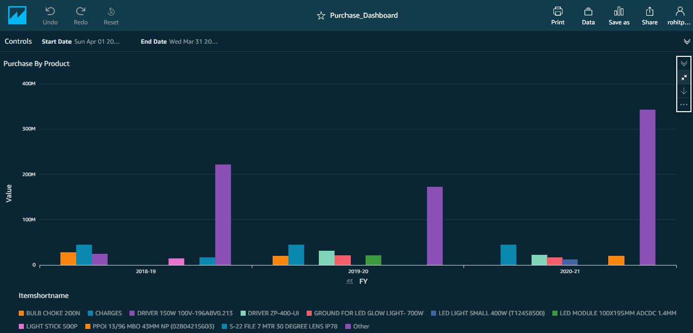
Purchase By Product
- This chart shows the current year purchase vis-a-vis last 2 years’ Purchase performance by Product.
- You can filter the Charts with a given date range. For example, you can view the performance for just a week.
- You can drill down from Year->Quarter and from Quarter->Month and back.
- To see the purchases of a particular product, just place the cursor on the bar.
- Legend at the bottom displays the top n Products.
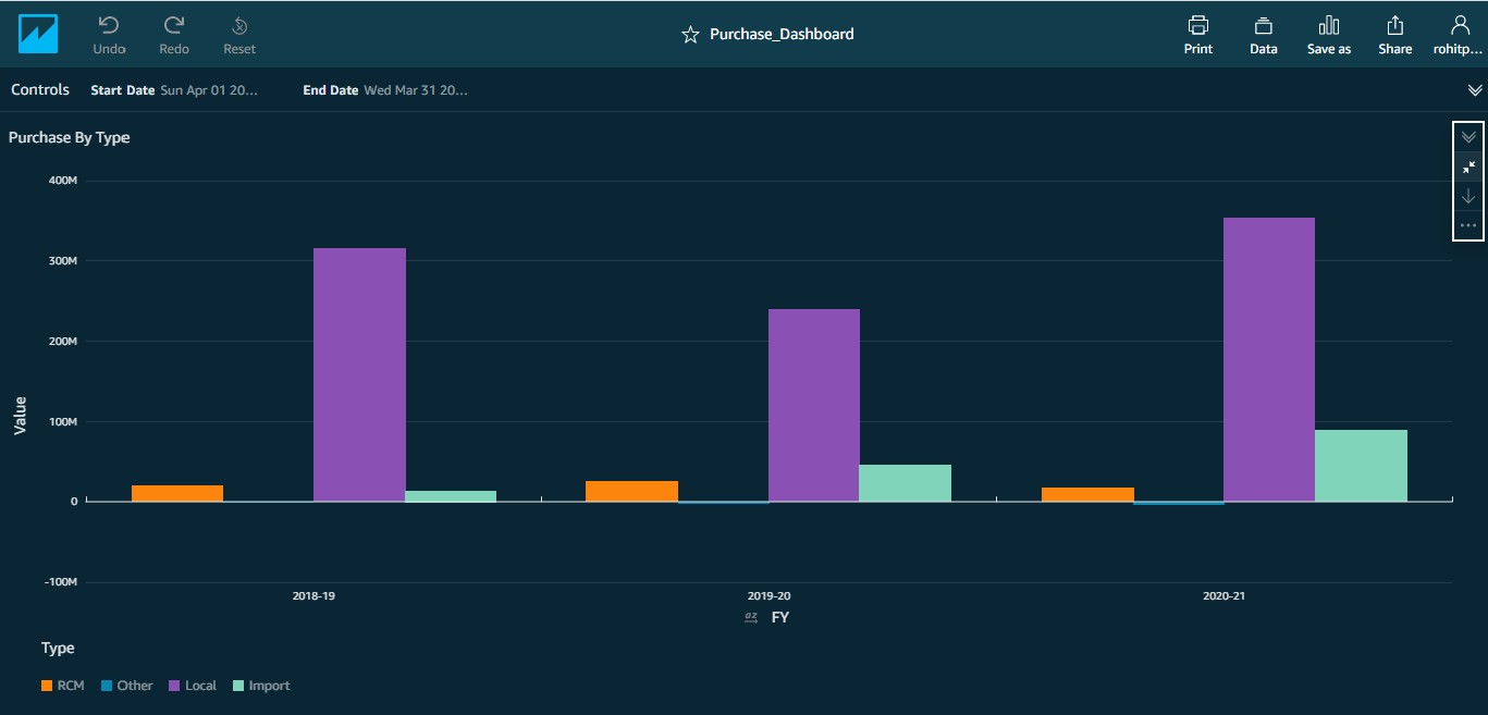
Purchase By Type
- This chart shows the current year purchase vis-a-vis last 2 years’ Purchase performance by Type.
- You can filter the Charts with a given date range. For example, you can view the performance for just a week.
- You can drill down from Year->Quarter and from Quarter->Month and back.
- To see the purchases of a particular type, just place the cursor on the bar.
- Legend at the bottom displays the n Types.
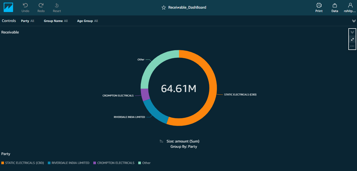
Receivable Dashboard
- This Donut chart shows the Receivables of top n parties.
- You have the option to filter the chart by Group name viz.,Customer Control Outside
- You can also filter the chart for a given party.
- A third filter option allows you to select one or more Age groups viz., 0-30, 31-60 & so on.
- An additional filter to consider all due amounts upto a given date is also provided. For example, if you want to ascertain the amount which is getting due in the next one week or fortnight or month, you can set a specific date in this filter.
- Legend at the bottom displays the Parties.
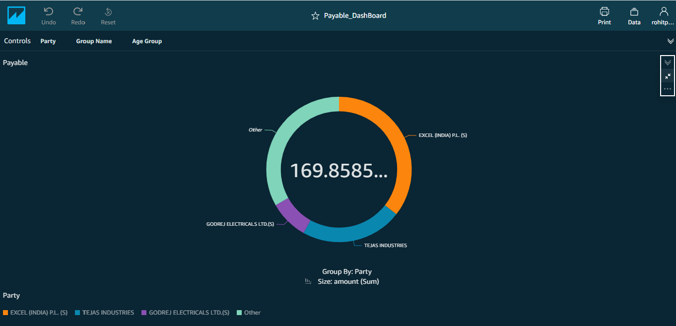
Payable Dashboard
- This Donut chart shows the Payables of top n parties.
- You have the option to filter the chart by Group name viz.,Customer Control Outside.
- You can also filter the chart for a given party.
- A third filter option allows you to select one or more Age groups viz., 0-30, 31-60 & so on.
- An additional filter to consider all payable amounts upto a given date is also provided. For example, if you want to ascertain the amount which is payable in the next one week or fortnight or month, you can set a specific date in this filter.
- Legend at the bottom displays the Parties.
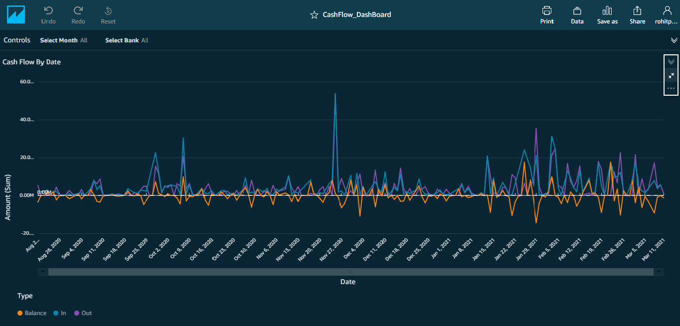
Cash Flow Dashboard
- In Cash Flow, there are two charts.
Cash Flow By Date
- This chart shows the cash flow over the last 6 months.
- On any given date you can see the Inflow, Outflow & Balance.
Note: When you place the cursor on the line graph(s), you can view the position on a particular date.
- You can filter the chart to show only for a given month.
- You can also filter for a given bank.
Note: It shows the Inflow, Outflow & the balance amount.
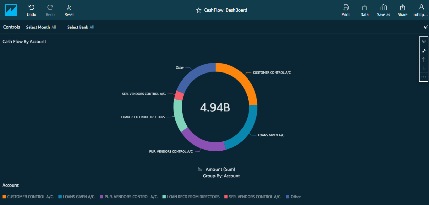
Cash Flow By Account
- This Pie chart shows the Cash Flow amount with respect to the type.
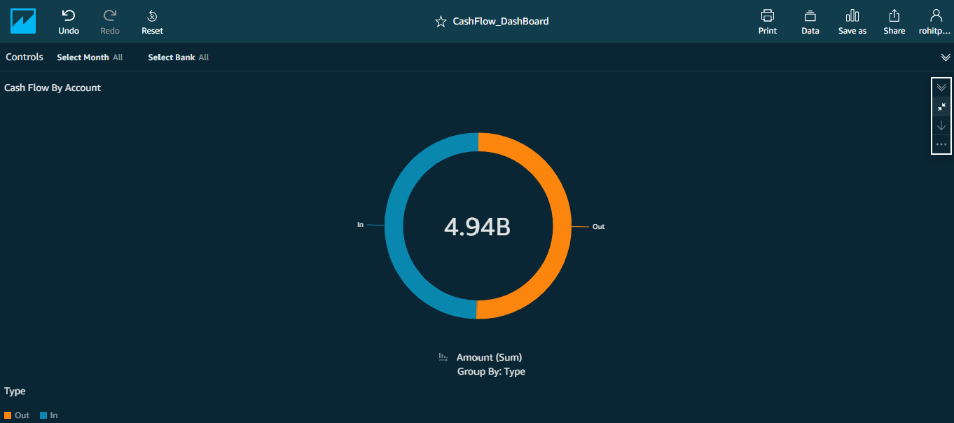
- This chart shows the position of Inflows & Outflows over major account heads.
- You can filter this chart by Month AND/OR Bank.
- You have the option to drill down the Inflow or Outflow by accounts heads. For example, you can view Customer Receipts in a given month & in a particular bank.
User Stats
- There are 3 charts in this dashboard.
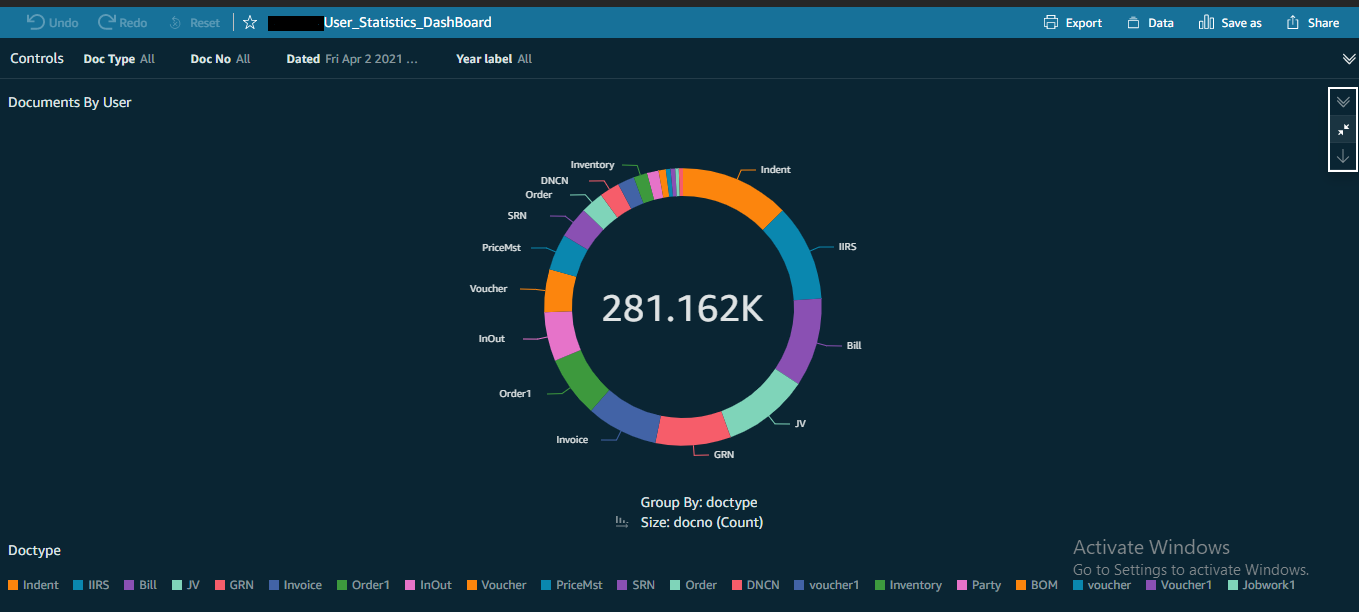
Documents By User
- This chart shows the documents by user.
- You have the option to drill down by username.
- You can filter this chart for a given financial year.
- Legend at the bottom displays the documents.
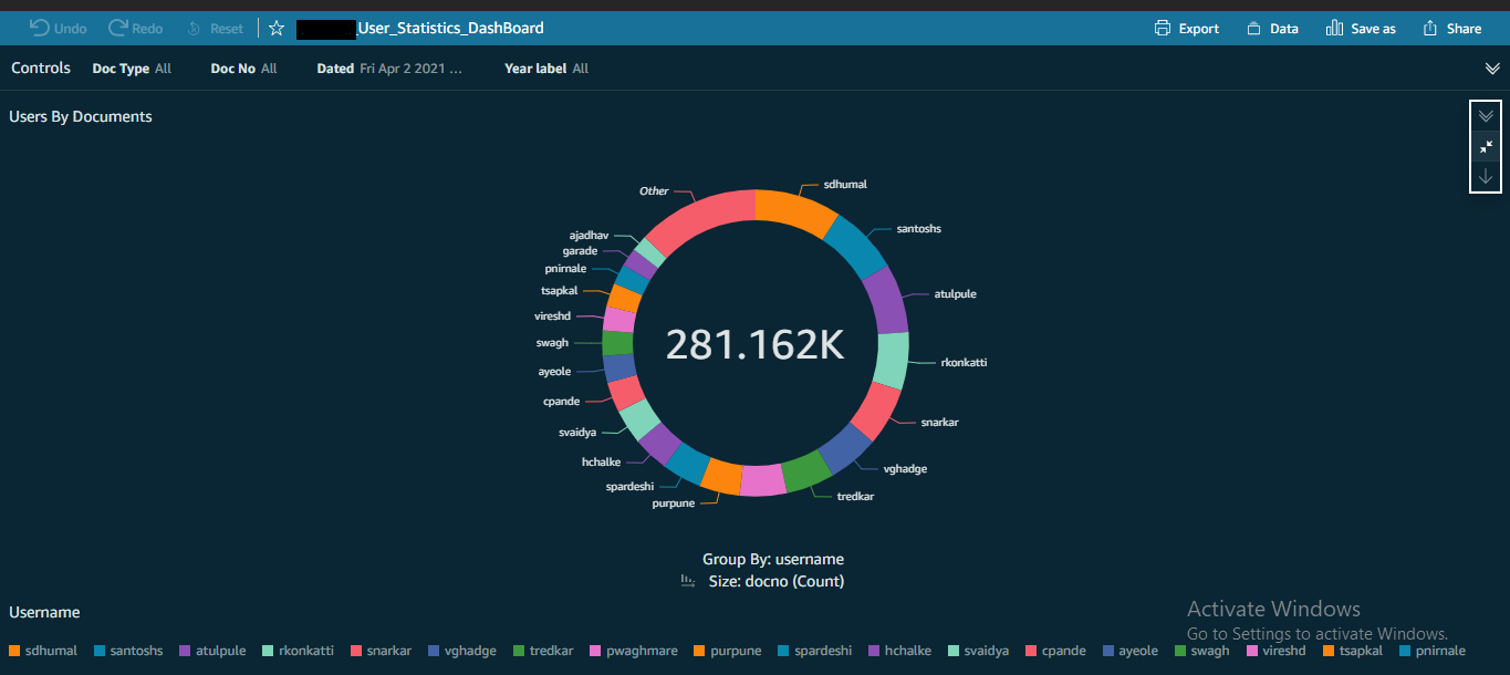
User By Documents
- This chart shows the user by documents.
- You have the option to drill down by document type.
- You can filter this chart for a given financial year.
- The following chart shows the top n users stats.
- Legend at the bottom displays user names.
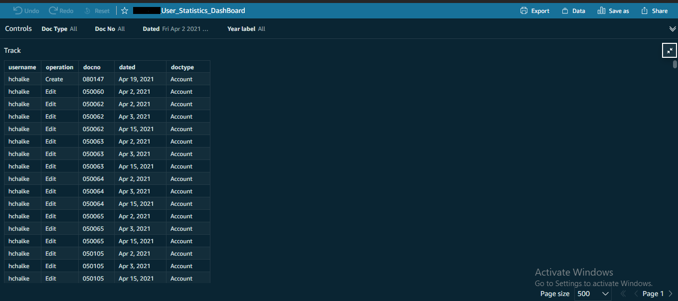
User Track
- This table helps you track a specific document audit trail.
- You can filter this chart for a given document type.
- You can also filter this chart for a given document no.
- Additional filters are available for a given date & financial year.
Note: Since data is huge, it’ll show only the first page.
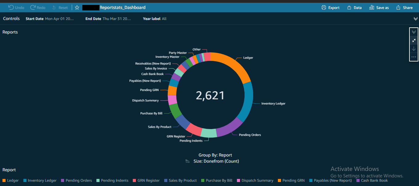
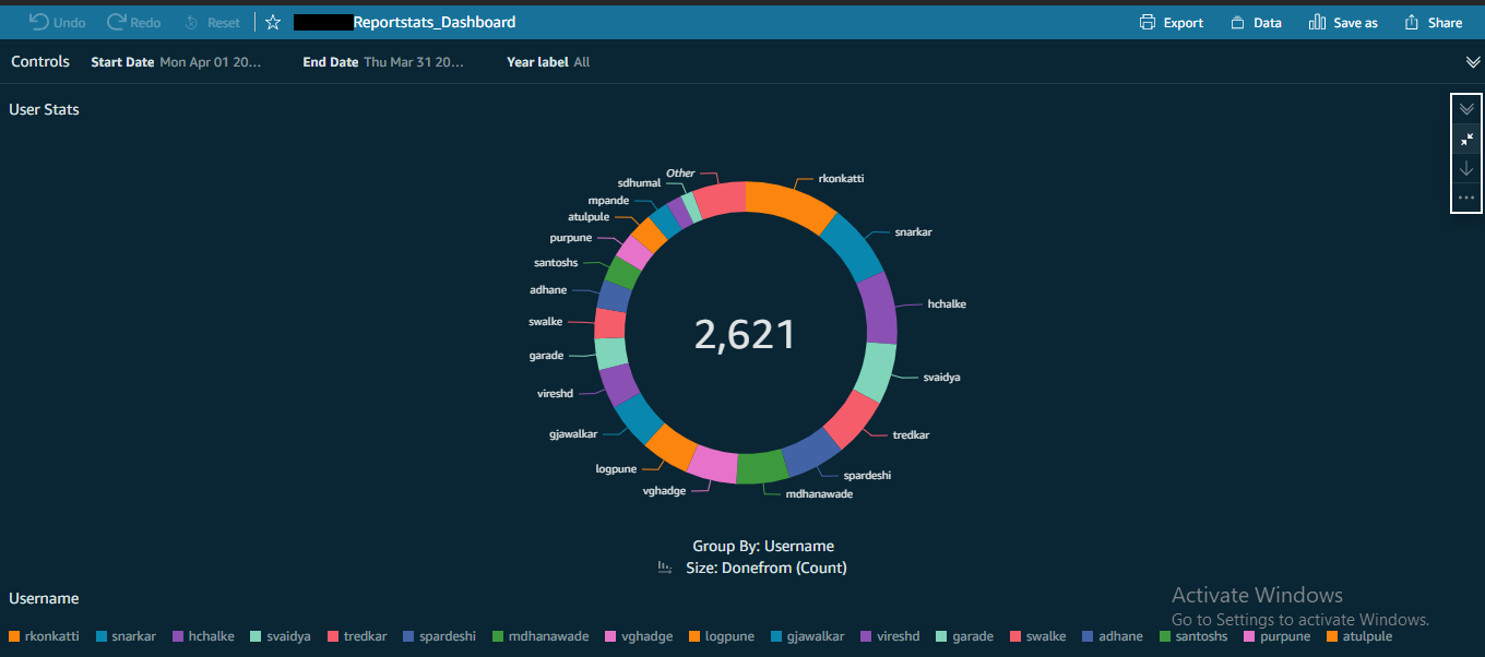
Report Stats
- There are 2 charts in this dashboard.
Reports
- This chart shows Report statistics.
- You have the option to drill down by username.
- You can filter the Charts with a given date range. For example, you can view the stats for just a week.
- You can also filter this chart for a given financial year.
User Report Activity
- This chart shows Report activity by User.
- You have the option to drill down by report.
- You can filter the Charts with a given date range. For example, you can view the stats for just a week.
- You can also filter this chart for a given financial year.
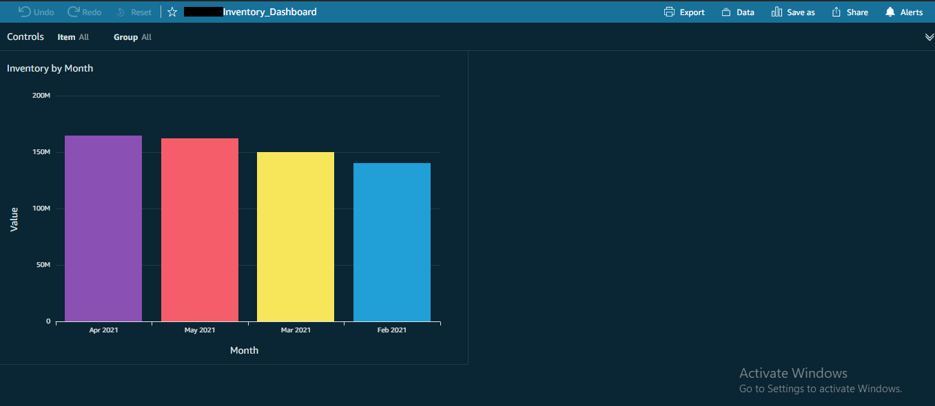
Inventory Dashboard
- This chart shows the Inventory analysis by month.
- You have the option to drill down by category.
- You can filter this chart for a given item.
- You can also filter this chart for a given group.
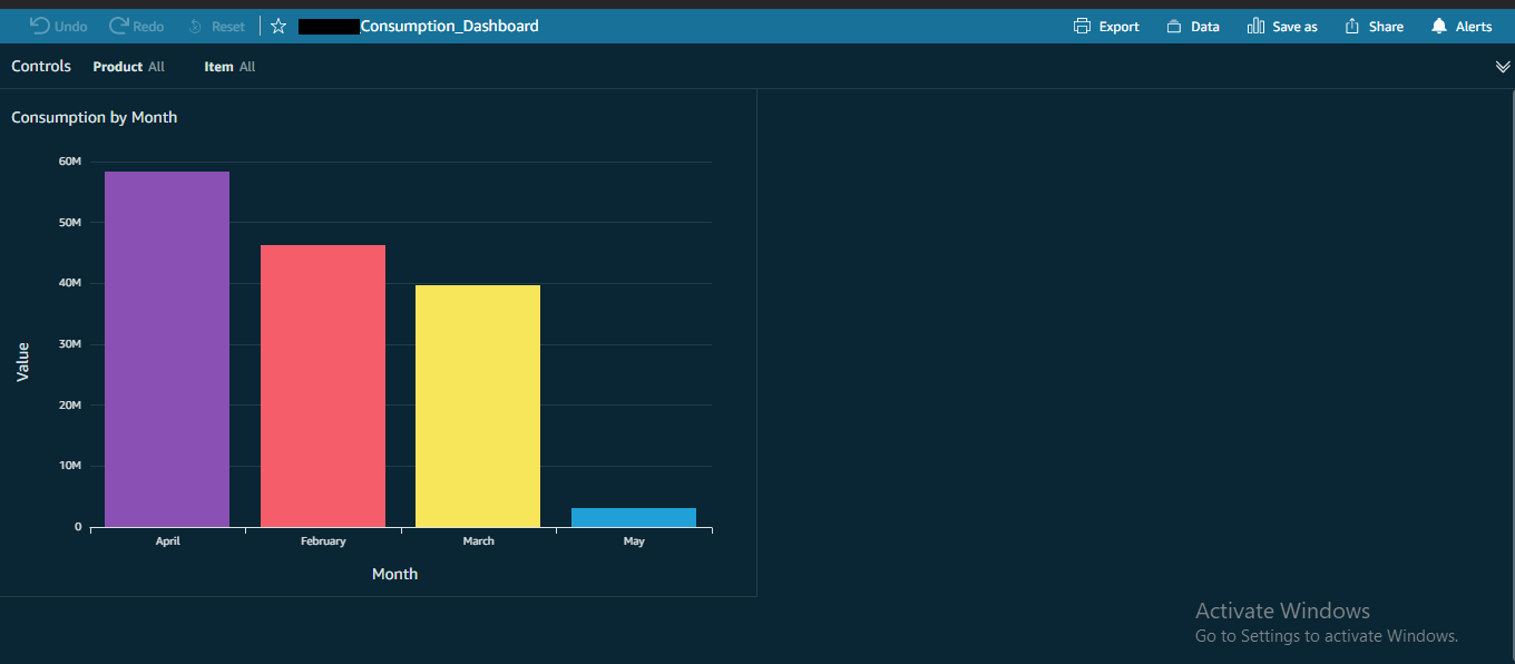
Consumption Dashboard
- This chart shows the Consumption analysis by month.
- You have the option to drill down by group.
- You can filter this chart for a given item.
- You can also filter this chart for a given product.